Responsive Web Design
MOBILE FIRST RESPONSIVE WEB DESIGN SERVICES
RESPONSIVE WEB DESIGN COMPANY
LEADING RESPONSIVE WEB DESIGN COMPANY
Mobile phones are used primarily for searching the internet these days. Therefore, your business should consider responsive web design services if you wish to optimize its website presence on tablets, mobile devices, etc.
Digi Rush ensures that your business website will run smoothly across all kinds of devices and screens with varying screen sizes regardless of the device. We can provide unmatched responsive web design services to you to get the best possible experience for your viewers.
GET STARTED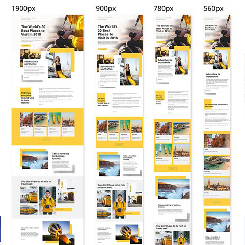
Our suite of Responsive web designs layouts includes:
165%
AVERAGE SEO TRAFFIC INCREASE AFTER 1 YEAR
70%
AVERAGE ROI INCREASE FROM SEO
326+
SEO PROJECTS COMPLETED
35%
CONVERSION RATE INCREASE
Why hire us?
Market centric offerings
We are a leading responsive web design company that complements your business with the right strategies, technical tools, and a market-centric approach.
Ensured results
Having the most technical knowledge in the industry will ensure that your results will be 100% guaranteed.
No multiple URS
We use a single URL to present your website to all the devices, ensuring that your website looks aesthetically pleasing on all of them.
Frequently
Frequently Asked Questions
Responsive design is an approach to web design that aims to create websites that provide an optimal viewing experience across a wide range of devices and screen sizes. This means that a website with a responsive design will automatically adjust its layout, content, and functionality to suit the screen size of the device it is being viewed on, whether it’s a laptop, tablet, desktop, or smartphone.
Responsive web design is important because it ensures that a website can be easily viewed and navigated on any device, regardless of the screen size or resolution, and provides a consistent user experience accessing the internet through mobile devices. A responsive design also helps with search engine optimization (SEO) and can save time and resources by eliminating the need for multiple versions of a website for different devices.
A responsive web design is crucial for every business as it ensures that your website is optimized for all devices, providing an excellent user experience regardless of the screen size. This results in improved search engine rankings, increased website traffic and conversions, and ultimately, higher revenue. A responsive web design is necessary to stay competitive in today’s digital landscape and meet the needs and expectations of your customers.
Mobile-friendly design is a simplified version of a website that is specifically designed for mobile devices as it offers limited features and content whereas Responsive design adjusts the layout of a website according to the screen size of the device it is being viewed on as it offers the same content and features as the desktop version but is optimized for different devices and screen sizes, ensuring an excellent user experience across all platforms.
To optimize images for responsive web design, you need to ensure that your images are of appropriate size and format, compressed to reduce the file size, and use responsive images that adapt to the screen size of the device they are viewed on by using lazy loading and consider image dimensions for different screen sizes. By following these techniques, you can significantly improve the page loading times and enhance the user experience on your website, making it more accessible to all devices and platforms.